Size and Resolution Per Media Type
Image Content
- File Type: PNG, JPEG, HEIC
- Ratio: 16x9 (Horizontal) - NOT Square or Vertical

- Displays Resolution & Dimensions
- Single Displays (Horizontal): 1920x1080 px @ 300ppi
- Video Walls (Horizontal): 3840x2160 px @ 300ppi
- Kiosks (Vertical): 1080x1920 px @ 300ppi
Video Content
- File Type: MP4
- Ratio
- Single Displays: 16x9 (Horizontal)
- Video Walls: 16x9 (Horizontal)
- Kiosks: 9x16 (Vertical)
- Full HD (1080p)
- Resolution
- Single Displays: 1920x1080 px @72ppi
- Video Walls: 3840x2160 px @ 72ppi
- Kiosks: 1080x1920 px @ 72ppi
- Less than 20 seconds - 6-10 seconds is the typical length as someone is walking by
- No Audio - Closed Captions must be used, if people are visibly talking

Standards & ADA Compliance
- College appropriate - Student/Employee/Visitor/Public Focused
- CCAC guidelines and image/branding standard
- Graphic, Brand Standard Guide
- Digital Style Guide
- Digital Signage Standards (see below)
- Include Contact information, link to webpage for more information, date and time of event
Content Layout
Overall Content for All Displays
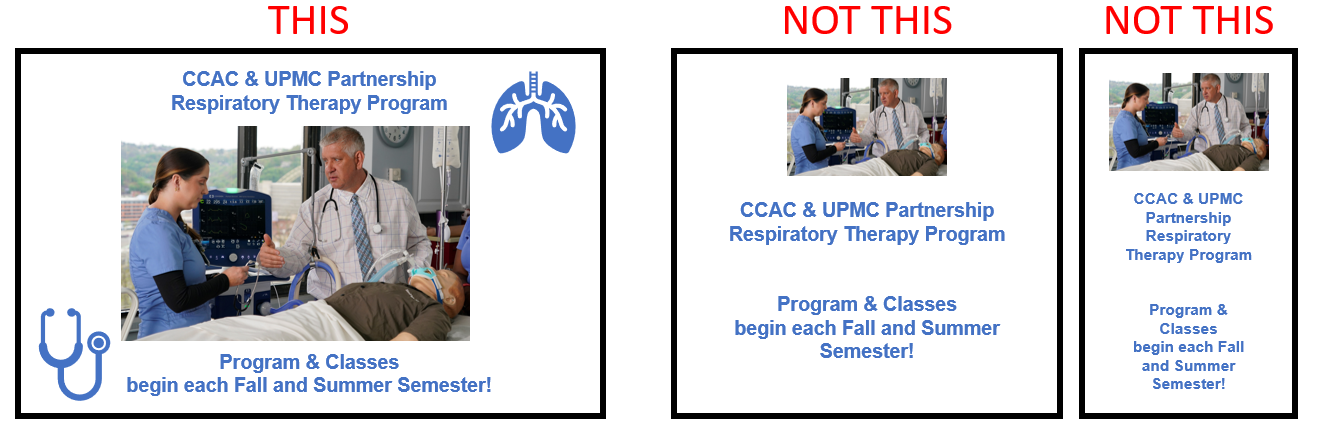
- Content should take up most of the screen space

- Padding around the edge of the display

Video Walls
- Design with crosshairs in mind, due to screen bevels. Text and QR codes will be split at the crosshair.

Template Designs
Templates are videos or an image with editable textboxes to overlay text. This is very helpful when it comes to content that needs quickly edited or constantly updated. Note that the text is static can cannot appear later if a video is used.

Style and Design
Overall Style
Modern and Clean Design - It is characterized by clean lines, minimalism, and focus on the key details of the information. Using solid colors and outlines to design images and icons to reflect the message of the text.
Icons and Images
|
Outlined Created out of strokes. These icons are simple and great to illustrate abstract meanings |
|
|
Solid Filled Composed of masses of solid color and omissions of strokes. Works best to illustrate the meaning of primary subjects |
|
|
Flat Flat icons are a variation of lineal style. This style implies different color combinations, usually “flat” ones |
|
 |
Picture or Scenes
|
Screen Time, Words on Screen, Reading Rate
- Screen time averages between 8-10 seconds
- Keep the information clear and concise - Making Great Digital Signage Content 2.0 (wirespring.com)
- 21 words max - the average person looks at the screen for 6-10 seconds and can only ready 21 words max in 6 seconds
Font(s)
- Size: 24px or higher
- Types: Sans-serif (Arial) fonts are the easiest to read
- Filled fonts are easier to read than outlines
- Legibility and Easily Understood - Cursive/Handwritten fonts are hard to read
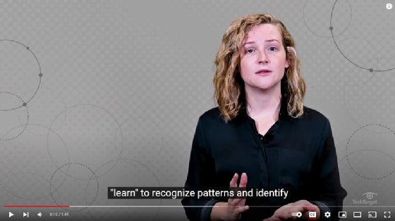
Closed Captioning
- Captions should have an accuracy of 99%.
- Font should be similar to Helvetica
- Use a white font color on a black background.
- Placed in the lower center of the screen but should be moved when important visual elements
- Each caption should hold 1-3 lines of text onscreen at a time, and should not exceed 3 lines.
- Background noises, or non-speech sounds, should be added in square brackets.
- Captions must be synced with the audio of the programming.
- If nothing is spoke/heard, there should be no closed captions on the screen
- Punctuation and both lower and upper case letters should be used

Color Contrast
- Contrast ratio of at least 4.5:1
- (L1 + 0.05) / (L2 + 0.05) - L1 is the relative luminance of the lighter of the colors, and L2 is the relative luminance of the darker of the colors.
- Web Accessibility Color Contrast Checker
- Understanding Contrast and Color Accessibility (WebAIM)
- Making great digital signage content: Use contrast to your advantage (wirespring.com)
QR Codes, Short Links
- 1" x 1" in Size
- On either bottom left or right of media, not in the middle
- If two or more QR codes, they should not be stacked

Creating a QR Code or Short URL
QR Codes
What is a QR Code
A QR (Quick Response) code is a type of barcode that can be scanned with a camera. They can be used to quickly share information like URLs, contact information, or even product information. QR codes can be scanned with a variety of apps and devices, making them a versatile tool for sharing information.
When to use a QR code
If you have a sign, flyer, print out, digital signage or other physical media, or where a person can walk up and scan the QR code.
Best Practices for a QR Code
How to Create a QR Code
- Create Your Own
- Build when you need them
- Branding options available
- No data analytics
- Web Page URL
- Event on Calendar or Contact Card Information
- Form Stack Forms
- Compose an Email Message
- Permanant QR codes
- CCAC Branded
- Meta Graph Images
- Data Analytics
- Request a QR Code:
Short URLs
What is a Short URL
A short URL is a type of link that can be used when the URL of a webpage is too long or hard to remember. They can be used to quickly share a link to a webpage. Short URLs can be used in a variety of ways, making them a versatile tool for sharing a webpage.
When to use a Short URL
If you are sending a text message or want to put a link on a flyer or media, and the URL is too long to remember. If the link is to be posted on a webpage, email or other digital for where the link's display text can be customized, you should NOT use a short URL.
How to Create a Short URL
- Do not use Bitly / bit.ly they do not specify how long their URL is good for.
- Instead, use Free Short URL Generator (Rebrandly)
- CCAC Branded Short Links, Meta Graph Images and Data Analytics
Formats For Date, Time, Contact Info, Location, Etc.
- Date: Day Of Week, Month Day - Monday, January 3th
- Time: 10:00 AM - 1:00 PM
- Email Address: CapitalizeFirstWord@ccac.edu
- Phone Number: ###-###-####
- Location: Full Campus or Center Name - Wing or Building - Room Number
- Example: South Campus - Building B - Room B345
Full Example
Thursday, May 4th
8:00PM-2:00PM
Allegheny Campus
PE Building - Room 421
Locations on Signage
If content groups all locations together, it will be displayed in the college wide screens. Otherwise, if only a specific location is listed, then it be displayed on that location's displays. It is recommended to do per location rather than grouping for more display time and campus awareness.
Timeline and Approval Process
- Content requires 10-business days for content creation. Content may be finished before then; however, it cannot be guaranteed.
- Once created, then the approval process begins. The approval process is not part of the 10-day content creation.
Other Information
- All signage must have an end date to ensure content is up to date.
- If it is per semester, the end date will be the end of the semester
- The requestor submitting the digital signage request is responsible for ensuring the relevance of the content. In the event of changes to dates, details, or if the content becomes outdated, it is the requestor’s responsibility to submit an update or removal request for the digital signage.
Best Practices and Tips for Digital Signage
- Check with someone not familiar with the information to ensure your details are getting across
- Animate your images in Canva


